Creating Bubble Plots
With the Bubble Plot Tool of the CoView, you create bubble plots for production data on wellbores or properties on markers and point sets. The bubbles are displayed on a map, where you can compare your data using the size and fill of the bubbles. You can access the tool in the Content tab of the CoView Manager via the context menu of the wellbores, well markers and point sets .
For well markers and point sets you can plot any property that exists under the respective data type in the JewelExplorer. For wellbores you can only plot production data. You need to link the production data to the wellbores before you can use it for plotting. To do so, see the section Link to wellbores.
With the Bubble Plot Tool you can control two main parameters of the bubbles:
- the size of the bubbles, based on a property/data series.
- the fill of the bubbles, based on a property/data series (bubble type plot) or multiple properties/data series (pie type plot).
For wellbores and well markers you can select which wellbore or marker to plot for data comparison. You do this by unchecking the checkbox of an individual wellbore or marker under their main object group in the CoView Manager. For example you can uncheck markers at side tracks that overplot the original well and should not be included for comparisons. When you want to include the markers or wellbores that you excluded, you need to check their checkboxes and re-run the tool.
Using bubble plots
Typically, you create bubble plots to quickly and easily compare and analyze the relationship between properties across a group of wellbores, markers or point sets. Below there are two examples on how to use bubble plots to visualize production data and marker properties in the CoView:
- You can create bubble plots on a group of wellbores (left image below) with a size that varies based on the total fluid production and a pie filling that shows the breakdown between different fluids. One plot shows the observed production data and the other plot the simulated production data.
- You can create bubble plots on a well marker (right image below) with a size that varies with thickness and a color fill based on porosity for one plot and a pie filling that shows different facies fractions for the other plot.
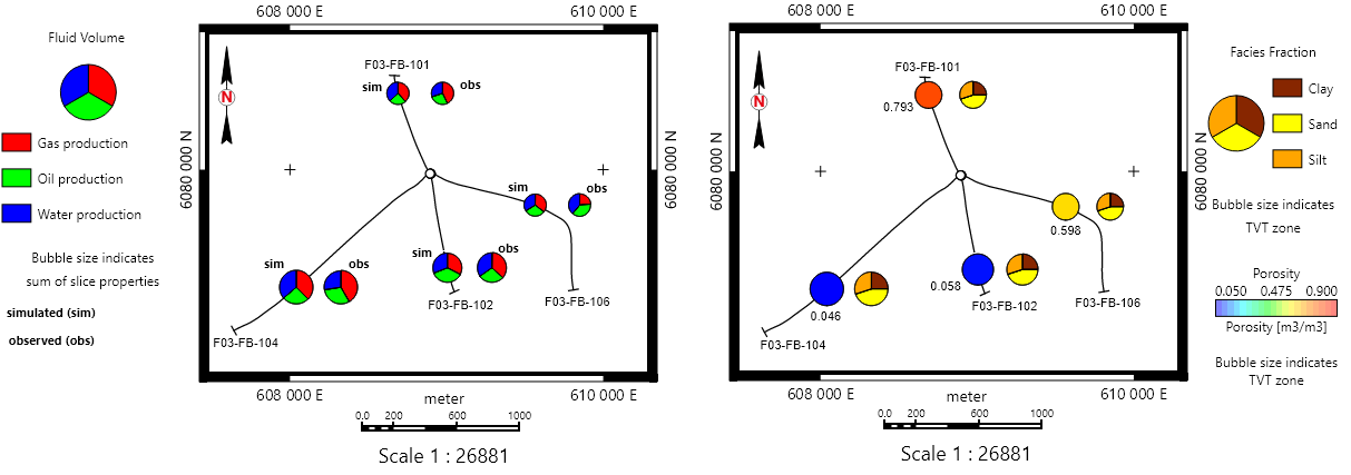
Two maps showing data represented by bubble plots. The map on the left shows four producing wellbores, each wellbore showing two pie plots: one with simulated (sim) data and one with observed (obs) data. The fills correspond to the respective fluid volumes and the size to the total fluid production. The map on the right shows the four producing wellbores with two different plots on the same marker. The fills correspond to porosity and facies fractions respectively and the size to thickness. click to enlarge
To create a bubble plot
- Open a CoView via Workspace > Views or by pressing Alt+F11 on your keyboard. The CoView Manager opens automatically.
- In the JewelExplorer, check the box of a group of wellbores, well markers or a point set to populate the Content tab of the CoView Manager.
- In the Content tab, right-mouse click on the top level of the wellbores, marker or point set to open the context menu and select the Bubble Plot Tool.
- On the Bubble Plot Tool form that opens, the Plot option is set to
 Create new by default. A predefined name is already listed. You can keep it as is, or enter another name for the plot.
 - Select plot type Bubble or Pie.
- Depending on the object you are creating the plot for, you specify the following inputs:
- In the Series column of the table, check the checkbox of the data series that you want to use to 'slice' the pie. You need to select at least two data series in order to create a pie plot.
- In the Color column of the table, you can see the default color of each data series based on how it is defined in the Property Catalog (HOME > Settings). You can change the display color for the data series you selected in the Series column. Click on the Color drop-down arrow and select a different color from the color palette.
- In the Property column of the table, check the checkboxes of the properties that you want to use to slice the pie. The table shows only properties that exist under the selected marker or point set in the JewelExplorer. You need to select at least two properties in order to create a pie plot.
- In the Color column of the table, you can see the default color of each property based on how it is defined in the Property Catalog (HOME > Settings). You can change the display color for the properties you selected in the Property column. Click on the Color drop-down arrow and select a different color from the color palette.
- After specifying the settings, click Apply to create the bubble plot and keep the form open, or click OK to create the bubble plot and close the form. Upon clicking:
- The bubble plot is created in the Content tab of the CoView Manager. You can find it in the group Plots under the data type you created the plot for (i.e., wellbores, markers or point sets).
- You can right-click on the name of the created plot under Plots to open its context menu. From the context menu options you can re-open the Bubble Plot Tool form or delete the plot.
- Click on the name of the created bubble plot in the Content tab to edit its display settings in the Display settings section (located at the bottom of the Content tab). You can use the Offset X and/or Offset Y entry fields to move the bubbles on the map in case they overlap with bubbles from another bubble plot or any displayed data.
- To show the values of a selected property as labels on the map, you need to select the property under the desired well marker or point set in the JewelExplorer.
- The CoView supports layer display. You can use the Up and Down arrows of the Content tab toolbar to control the display order of objects on the map. This way you can bring the bubbles on top of a surface or hide them behind a different object.
- To create a legend for your bubble plot, right-click on the map and from the CoView context menu select Add to Framework. From the Content Element list select Bubble Plot. This creates an empty placeholder for the legend. To populate the legend framework with the created plot, you need to select first the Bubble Plot object in the Framework tab of the CoView Manager and in the Display settings section select the plot from the Source drop-down list.
For wellbores, you can only use production data to generate bubble plots. In the Format tab, you select a production data set and you define the size and fill of the bubbles by different production data series (e.g., oil production rate and water production rate).
Production Data
Data set Select a production data set from the drop-down list.
Series type Select a series type from the drop-down list. The list displays the series types that the selected production data set contains.
Size
Fixed Sets the bubbles to a specified size. Use the arrow buttons to change the bubbles' size or enter a value in the entry field. By default, the display bubble size is set to 10 pixels.
Range Sets the bubbles' size based on the values of the data series.
Series Select a data series from the drop-down list.
Use sum of fill series (available only for pie type plots) When you check this option, the size of the bubbles is based on the sum of the data series that you select under 'Fill' in the next step.
By default, the minimum and maximum values of the selected series correspond to a display bubble size of 5 pixels and 15 pixels respectively. You can change the display size range and/or the series value range with the following options:
Minimum / Maximum Use the arrow buttons or enter a value in the entry field to change the minimum and maximum display size of the bubbles.
Value range When you check the box, you can change the data series value range that corresponds to the min/max display size. Enter the values in the entry fields below.
Fill (bubble type plot)
No Fill Shows the bubbles as circles with no fill color.
Series Fills the bubbles with the color that corresponds to the data series value in the series' color set. Select a series from the Series drop-down list.
Value range When you check the box, you can change the data series value range that corresponds to the min/max display color. Enter a value in the Minimum and/or Maximum entry fields.
Color Fills the bubbles with a fixed color. Click on the Color drop-down arrow and select a color from the color palette.
Fill (pie type plot) Fills the slices of the pie with the color that corresponds to the values of the selected series.
In the Location tab, you specify where along the well trajectory you want to display the production data that is represented by bubbles.
Well trajectory
Top Select to display the production data at the start of a wellbore.
Bottom Select to display the production data at the end of a wellbore.
Depth (TVDSS) Enter a depth value in the entry field to show the production data at the specified depth.
Surface Displays the production data at the depth where the selected surface intersects the well trajectory.
Source Select a source from the drop-down list.
Surface Select a surface from the drop-down list. Surfaces of type 'horizon', 'unconformity', 'intrusion' and 'fluid contact' with 2D grid or tri-mesh representation are available for selection.
For well markers and point sets you can control the size and fill of the bubbles. The bubbles are displayed on the map at well marker and point location. You can vary the bubbles' size and fill with the following options:
Size
Fixed Sets the bubbles to a specified size. Use the arrow buttons to change the bubbles' size or enter a value in the entry field. By default, the display bubble size is set to 10 pixels.
Range Sets the bubbles' size based on the values of a property.
Property Control the bubbles' size based on the values of a property. Select a property from the drop-down list. The list shows only properties that exist under the selected marker or point set in the JewelExplorer.
Use sum of fill properties (available only for pie type plots) When you check this option, the size of the bubbles is based on the sum of the properties that you select under 'Fill' in the next step.
By default, the minimum and maximum values of the selected property correspond to a display bubble size of 5 pixels and 15 pixels respectively. You can change the display size range and/or the property value range with the following options:
Minimum / Maximum Use the arrow buttons or enter a value in the entry field to change the minimum and maximum display size of the bubbles.
Value range When you check the box, you can change the property value range that corresponds to the min/max display size. Enter the values in the entry fields below.
Fill (bubble type plot)
No Fill Shows the bubbles as circles with no fill color.
Property Fills the bubbles with the color that corresponds to the property value in the property's color set. Select a property from the drop-down list.
Value range When you check the box, you can change the property value range that corresponds to the min/max display color. Enter a value in the Minimum and/or Maximum entry fields.
Color Fills the bubbles with a fixed color. Click on the Color drop-down arrow and select a color from the color palette.