Analyze Results View
The interface of the view is divided in two sections. On the right side, the Tornado/SPS charts, the CCDF/PDF plots (Complementary Cumulative Density Function and Probability Density Function, respectively) and Grouped Pareto plots are displayed for the selected study. On the left side, you can change the display controls for the plots in the Chart Settings and Filter section.
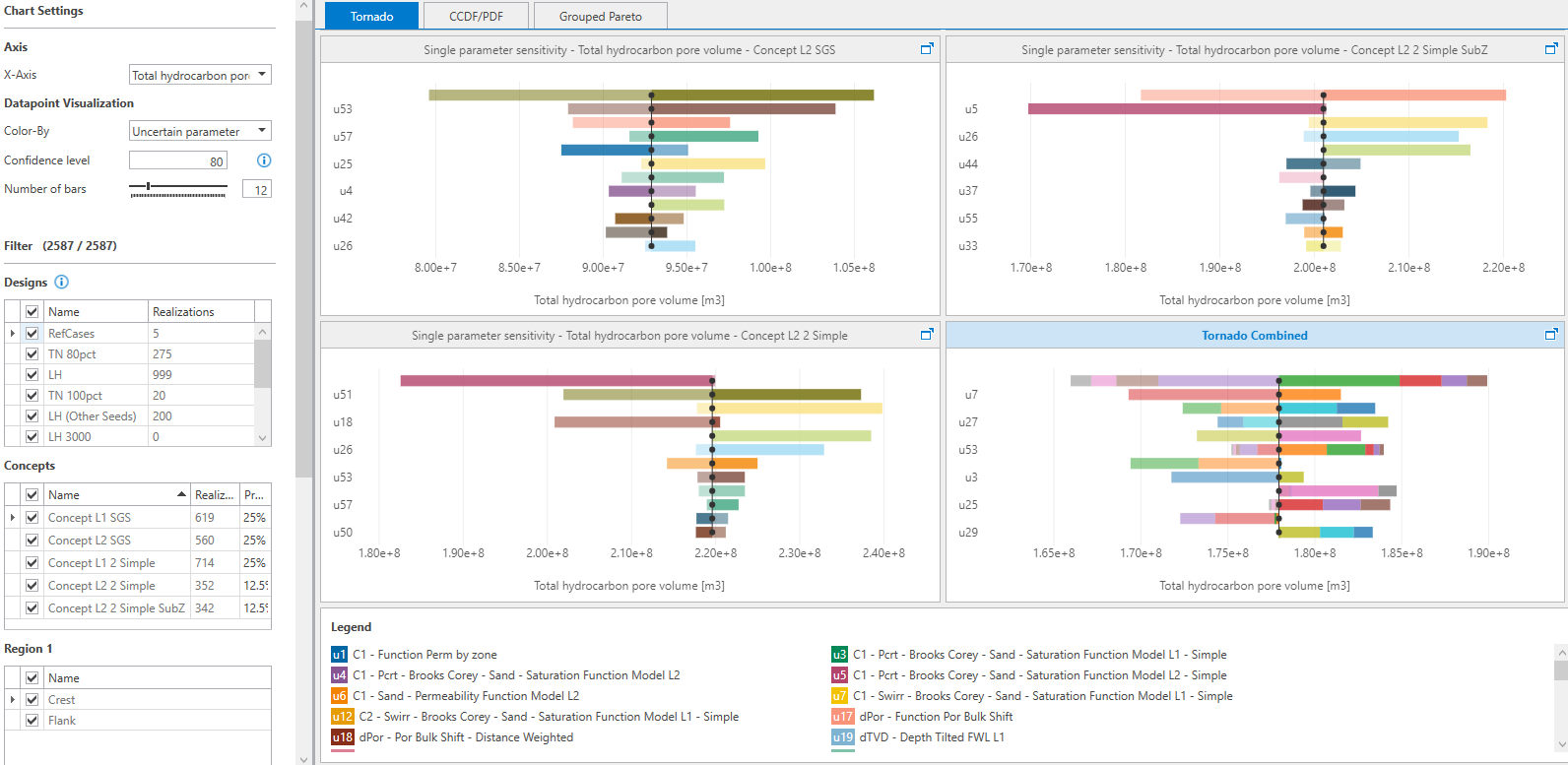
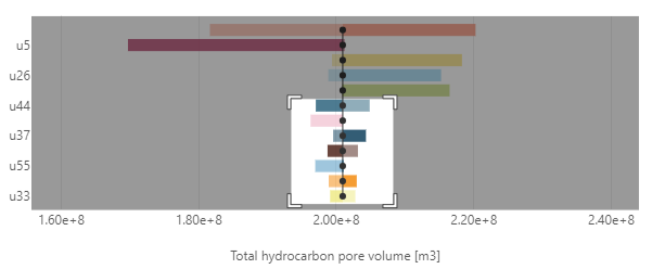
Overview of the Analyze Results tool showing the Tornado plots for each volumetric concept and legend showing all the uncertainty parameters in the bottom on the plot. Chart settings and Filtering options are on the left side to control the display options on the Tornado, the CCDF/PDF and the Grouped Pareto plots. click to enlarge
Plotting methodology for Tornado/SPS charts
JewelSuite uses a regression technique to generate a trend line for each observable, which is based on the already run realizations from the filtered Concepts and Designs. The resulting trend line then interpolates or extrapolates the observables for the other values of the uncertainty parameters, and generates the Tornado/SPS chart. The Tornado chart shows the simulation results from a single Tornado design. The SPS chart is based on a linear proxy from multiple designs and predicts responses. Generally, the trend line estimates contain some regression error.
Chart Settings and Filter
For the selected volumetric study, the Chart Settings section has the options to control the display settings of the plot. In the Filter section, you can select the designs, concepts and regions associated with the volumetric study that you want to display on the plots.
Chart Settings
Refresh Use the Refresh button to update the information on the Analyze Results form with the underlying data as specified in the Volumetrics Study workflow. For example, when you make changes on the Results Summary form (e.g. you apply 'Ignore results' to a realization, or change its name in the 'Name' column), or when you remove a design on the Designs form, the charts will be updated upon clicking Refresh.
Axes
X-Axis Select an observable from the drop down list. For Tornado and CCDF/PDF plots, make sure to select an observable that was part of the study results, i.e. selected on the Define Observables form in the Volumetrics workflow in the Study strip. The Tornado and CCDF/PDF plots display results with reference to this observable on the X-axis.
Y-Axis On the Tornado chart, Y-axis displays the uncertainty parameters for the selected designs and concepts. You can control the number of uncertainty parameters to be displayed on the Tornado chart by changing the number of bars in the Chart Settings section. On the CCDF/PDF plots, Y-axis displays the frequency or number of bins for the PDF plots while percentage probability for the CCDF plots. Use the number of bins in the Chart Settings section to change the frequency for PDF plots.
Observable (Grouped Pareto) Select an observable from the drop-down list. The Pareto Plot displays the relative contribution of the different uncertainties by groups as % of fraction of the total variability for the selected observable in vertical bars. The Pareto plot also shows a cumulative impact line curve that shows the aggregate impact of all groups 'to the left'.
Datapoint Visualization
Color by Use the drop-down list to change the Tornado plot perspective between uncertainty parameter or concept. This option is limited to concept only for CCDF/PDF plot. If you select Uncertain parameter (for Tornado/SPS plot), each bar representing an uncertainty parameter is indicated with a specific color. If you select Concept, each volumetric concept is represented with a Tornado/SPS plot and displayed by a specific color.
Confidence level (SPS plot) Enter a value, between 0 and 100, for the confidence level to control the results from the uncertainty parameter’s sampling range. The default value is 80. If the parameter distribution has been truncated ('Min truncation'/'Max truncation' on the Uncertainty Parameter dialog), the confidence interval on this tool is applied to the truncated distribution.
Number of Bars (Tornado plot) Click on the tick pointer on scale and drag it to limit the number of uncertainty parameters displayed on the Tornado plot. Number of ticks on the scale is limited to the maximum number of uncertainty parameters combined for all the concepts. Optionally, you can enter a value in the adjacent field.
Sensitivity analysis method (Tornado/SPS plots) Choose between Tornado and SPS plot. The Tornado plot shows the simulation results from a single Tornado design. The SPS plot is based on a linear proxy from multiple designs and predicts responses.
Number of Bins (CCDF/PDF plots) Choose the number of bins from the drop down list that you want to use to display the PDF plots.
Parameter Groups (Grouped Pareto) Select which groups to visualize in the Pareto plot. Default shows the default groups created by the application (based on model type and uncertainty parameter). User-Defined shows the groups as set on the Edit User-Defined Pareto Groups form. Click on the User-Defined Groups... button to open the form.
Filter
In this section, you can filter the designs and concepts from the study that you want to display on the Tornado and CCDF/PDF plots. In the adjacent brackets, you can check the filtered realizations versus the total number of realizations in the study.
Designs Table with the list of all the Designs associated with the volumetric study. The columns in the table are the design name, the number of filtered realizations and the total number of realizations in each design. The filtered realizations lists the number of realizations as a result of the selections you make in the filter section. The total number of realizations lists the total number of realizations per design, and takes the number of ignored realizations (see Results Summary) into account.
Concepts Table with the list of all the Volumetric Concepts assigned to the volumetric study. The three columns in the table are the concept name, associated number of realizations for each concept, and the probability value of the concept.
Reporting Regions Each reporting region, and boundary if applicable, has a table with its associated entries as defined on the Define Observables form of the Volumetrics workflow in the Study strip. When you have selected a boundary, apart from selecting to show the observable Outside the boundary and/or Inside the boundary, you can also show the observable as equity (which is the ratio inside/total).
Based on the designs, concepts and reporting regions selected, the total number of realizations from current selection are shown next to Filter.
Export to .xlsx
Use this button to export and save the results of the selected designs, concepts, and regions that you select in the Filter section. The data presented in the exported .xlsx file (Analyze_results_for_<name of the study>.xlsx) consists of input values of parametric uncertainties and observable values per realization for the summarized regions. The data is provided in different tabs for your convenience. If a boundary is selected, the data shown in the 'Data table' tab reflects the selected boundary filter for the observable: Inside, Outside, or Equity. If Equity is selected, the values shown are Inside+ Outside, and an extra column for Equity is added for the observable. The Metadata tab lists your selection. The statistics of uncertainty parameters in the study along with the P10-P50-P90 values of the observables, the CDF percentile and observable value, per concept and combined concepts and the proxy R2 information are also exported. So is the underlying data for the Pareto plots (i.e. the group names, the uncertainty parameters, the proxy, the selected observable).
Tornado/SPS, CCDF/PDF and Grouped Pareto plots
The charting area to analyze results consists of three tabs - Tornado/SPS plot, the complementary cumulative density function and probability density function (CCDF/PDF) plots, and Grouped Pareto plots. The Tornado/SPS plot for each volumetric concept plots the observable values for each uncertainty parameter, with the uncertainty parameter having the highest range of observable values at the top of the stack. The complementary cumulative density function (CCDF) indicates the probability that the observable value is exceeded ('principle of exceedance'). The probability density function (PDF), or the frequency plots, plots the probability distribution of the observable values from all the realizations. The Pareto plot visualizes uncertainties that are grouped by (types of) uncertainty parameters to help you focus on the biggest contributors. The Pareto plot contains both vertical bars and a line graph, where the values are represented in descending order by bars, and the cumulative total is represented by the line.
On the Tornado/SPS tab, each volumetric concept has an associated Tornado plot along with a combined Tornado plot. By default, the Tornado plots are displayed after the results are loaded on the charting area. Click on the CCDF/PDF or Grouped Pareto tab to switch to the CCDF/PDF or Grouped Pareto plot display.
Combined Tornado/SPS and CCDF/PDF plots
If the assigned volumetric scenario in your study consists of multiple concepts, a combined Tornado/SPS plot and combined CCDF/PDF plots is displayed automatically on their respective plot tabs. The combined Tornado/SPS plot displays stacked observable values for all the concepts, each concept represented by different color. The observable values in the combined Tornado plot show the weighted simulated results from a single Tornado design. The observable values in the combined SPS plot are calculated based on the concept probability weighted average contributions of the observable values from the selected concepts. The low and high observables values for each uncertainty parameter are also calculated using this method.
The combined CCDF plot is represented by a single curve and is calculated based on the concept probability weighted average contribution of the CCDF values from the selected concepts. The combined PDF plot displays stacked bins of observable values with each concept represented by a color. The sample propositions values from each concept is weighted based on the probability values of selected concepts. The predicted reference observable values are also highlighted on the CCDF curves with large circular points. These highlighted values are not the actual reference observable values but an interpolation of reference values using the proxy function as described in the plotting methodology above.
- For each Tornado/SPS plot in the charting area, the uncertainty parameters are listed on the Y-axis and the selected observable on the X-axis. Each volumetric concept, and the associated uncertainty parameters in the volumetric study, has a dedicated Tornado plot. To activate or deactivate results for a specific concept, check the box adjacent to concepts listed in the filter section. The Tornado plot shows the simulation results for the observable from a single Tornado design, whereas the SPS plot shows the proxy predicted observable response. These results will be different.
- Change the display Unit and Format of the observable using the context menu on the X-axis. By default, the display units are the same as used for solution.
- Maximize each Tornado plot using the maximize icon
 on the top right corner of the plot and analyze the plot individually. Use the Minimize icon
  or Esc to restore back the plot.
 - Adjust the axes position by hovering the mouse over the X- or Y-axis, click and hold the bidirectional arrow, and drag the cursor towards either side to adjust the axes.
- On the plot, each uncertainty parameter bar is displayed with a different color. These colors are predefined and cannot be customized. The lighter shade of the color on every bar denotes the lower end of the uncertainty parameter value while the darker shade denotes upper end of the parameter value. The center line of the Tornado indicates the reference value, as defined for all the uncertainty parameters.
- Hover the cursor over the bars to read the uncertainty parameter name, the parameter value, respective observable value, and the associated concept name. The label also indicates if it is a low case or high case. Hover the cursor over the vertical black line to read the simulated reference case response value for a Tornado chart, and the predicted reference observable value for the SPS chart.
- You can zoom-in on the plot to view more details or maximize the content displayed on the Tornado/SPS plot. Drag the mouse across the plot area of interest and the selected area in white is zoomed in. You can zoom along an axis direction by hovering the cursor above the axis, and dragging the cursor along the axis to select a zoom area. Double click on the Tornado/SPS plot to restore the plot to the default view.
- By default, the plot legend in the bottom of the Tornado chart lists all the uncertainty parameters. Common parameters in multiple concepts share the same color definition.
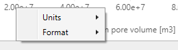
Use the context menu of the axis to change the units or numbering format. click to enlarge
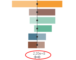
Adjusting the axes position. click to enlarge
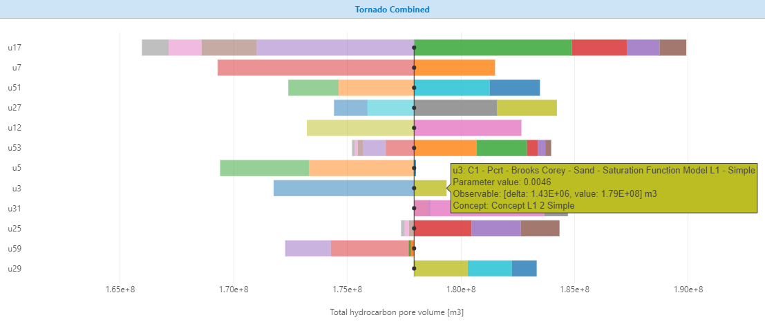
Reading the volumetric study results on the Tornado plot. click to enlarge
A preview window highlights the zoomed-in area of the chart. click to enlarge
- By default, four standard plots are stacked in the CCDF/PDF charting area. The first row consists of PDF and CCDF line plots with each volumetric concept, and their respective results, represented by a line. The bottom row consists of PDF (histogram) and CCDF (line) plots showing the results combined for all the concepts.
The table above the plots shows the combined statistics of all the concepts.
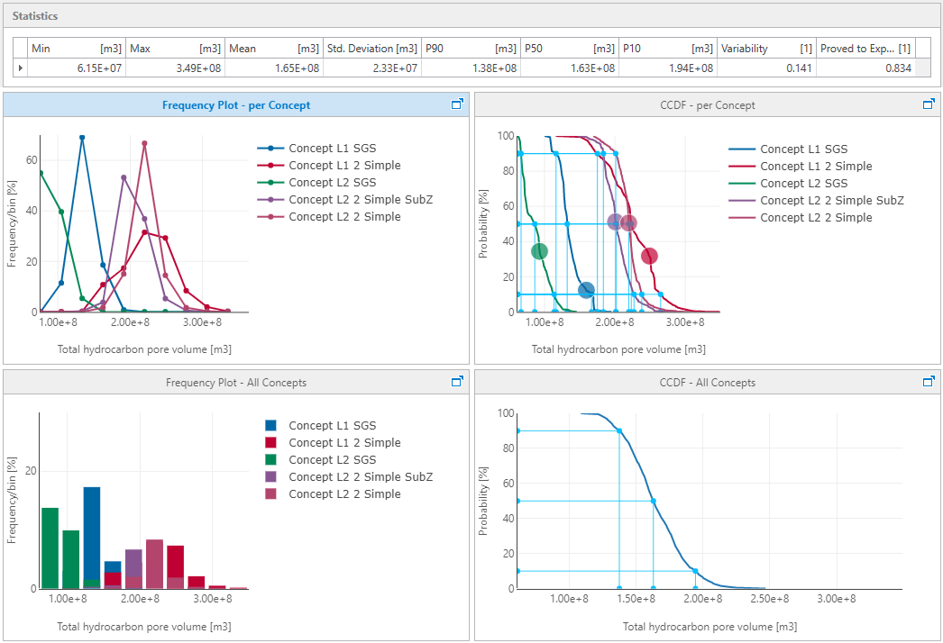

Overview of CCDF and PDF plots. Top row of the plots consists of curves per concept. Bottom row shows PDF and CCDF plots for all concepts combined together. click to enlarge
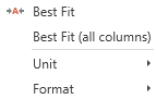
- The Statistics table, top of the charting area, shows the statistics for the selected observable in the Chart Settings section, combined for all the concepts in the study. Note that the reported statistics, and consequently the plot results, change if you filter the designs, concepts or regions in the Chart Settings section. Access the context menu of the statistics table by right-clicking on the header row of the table. Select ‘Best Fit’ or ‘Best Fit (all columns)’ to fit the column width for selected column or the entire table.

Adjust the column widths of the statistics table, and change the units and format using the context menu. click to enlarge
- Change the display Unit and Format of the observable using the context menu of the X-axis on all the plots or the context menu of the statistics table.
- Change the Number of Bins in the Chart Settings section for PDF plots (per concept and All concepts). The drop-down list has the following options: 5, 10, 15, 20, 30, 50.
- The Predicted reference observable values are highlighted for each concept with large circular point on the CCDF curve. Note that these values are not the actual reference observable values but an interpolation of reference cases using the proxy function. The plots also projects the P10-P50-P90 values for each concept and also for the combined Tornado plot.
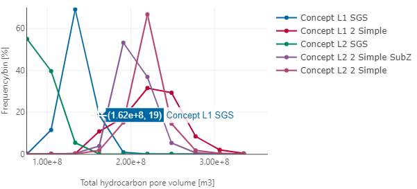
- Hover the cross-hair over the plot lines or histogram to read the results on CCDF/PDF plots. In the example below, observable value of total HCPV is 1.62E+8 m3 with a frequency of 19% for the concept curve in focus.

Read the results on CCDF/PDF plots by hovering over points or bars. click to enlarge
- (Only for Ad hoc and Latin Hypercube) You can highlight a particular realization on the CCDF plot with a large point. To do this, you have to give the realization a name in the 'Name' column on the Results Summary form. Hover the cross-hair over the point to read the information about the realization.
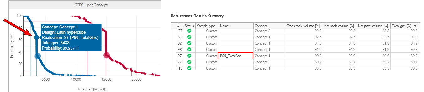
Highlight a realization via a large point on the CCDF plot (left image) by giving it a name on the Results Summary form (right image). click to enlarge
- Right click over the plot to Show or Hide the plot legend. You can hide the results for a concept on the plot by clicking on the concept name in the plot legend. Note that the concept results are only hidden on the plot display and not filtered out. In the image below, the names of the hidden concepts are grayed out in legend.
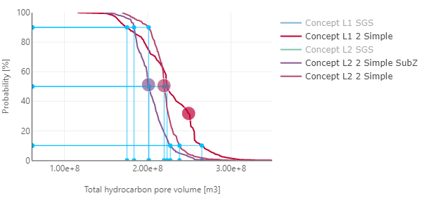
Show or hide the results of a concept by clicking on the concept name in plot legend. Read the projected P10-P50-P90 observable values for each concept along with the predicted reference observable value. click to enlarge
- Maximize each plot using the maximize icon on the top right corner of the plot. Use the Minimize icon or Esc button to restore back the plot.
- Zoom-in on any CCDF/PDF plot to view more details or maximize the content displayed on the plot. Drag the mouse across the plot area of interest and the selected area in white is zoomed in. Double click on the plot to restore the plot to the default view.
- For each Pareto plot, the % of fraction of the total variability is listed on the left Y-axis. The cumulative % is listed on the right Y- axis. The groups are listed along the X-axis as vertical bars that express the relative impact of a group on the observable. The data shown is for the observable that you select in the Chart Settings section from the Observable drop-down list (by default, Total BOE in place is selected). To activate or deactivate results for a specific design, concept or region, check or uncheck the box adjacent to it in the filter section.
- In the Chart Settings section, select if you want to visualize the data using the Default grouping (grouping is done by model type and uncertainty parameter), or by the User-Defined grouping. To review the current settings, open the User-Defined Groups form by clicking on the button.
- You can maximize each Pareto plot using the maximize icon on the top right corner of the plot and analyze the plot individually. Use the Minimize icon or Esc to restore back the plot.
- On the plot, each vertical group bar is displayed with a predefined color that cannot be customized. Two special groups are added to the grouped uncertainties:
- The Concept group (green bar) The Concept group shows the impact of the concepts on the observable: by merely picking a single concept, the expectation value for the observable will be different. The Concept bar shows how much the concepts impact on the weighted mean of them all. If this bar is high, this means that the results for each concept have a very wide range. Selecting a concept has a high impact on the uncertainty.
- The Non-Linear effects (red bar) The non-linear effects are the aggregate of seed numbers used in stochastic modeling (which are inherently non-linear), but also result from the non-linear response of the physics modeled. If this value is high, the proxy prediction quality is low. This means that the simulation results cannot be explained well by this proxy.
- The Pareto plot contains both vertical bars and a line graph, where the values are represented in descending order by the vertical bars (biggest impact on the left), and the cumulative total is represented by a line curve that shows the aggregate impact of all groups 'to the left'. Hover the cursor over the bars to read the group name, the value in % of fraction of the total variability and the number of uncertainty parameters in the group. Hover over the line to read the cumulative value. The cumulative value is a normalized value that is calculated without taking into account the contribution of the non-linear effects group.
By default, two Pareto plots are shown: the 'Independently Grouped Pareto' plot and the 'Dependently Grouped Pareto' plot. When dependencies between uncertainty parameters is not defined, the addition of impact from individual uncertainties into the impact of their group is done in these two ways. The independently grouped plot is calculated using the following statistical rule: the variance of the sum = the sum of the variances (which assumes that there is no correlation between variables). It shows the minimum grouped impact. The dependently grouped plot is calculated by adding up all contributions. This method shows the maximum impact for partial dependencies that are not captured in the parametrization.
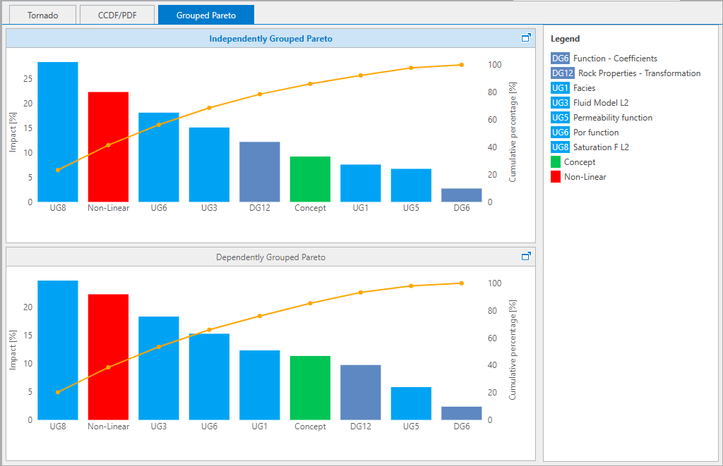
The relative contribution of the different uncertainties by groups on the Grouped Pareto plot. click to enlarge
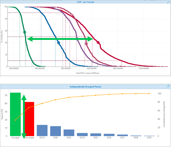
Each concept is displayed by a specific color in the CCDF plot. The ‘spread’ of the mean of these concepts determines the height of the concept bar in the Pareto plot. If the Concept bar has a high value, this is an indication that the concepts result in very different values of the mean observable. click to enlarge
Working with a Pareto plot is usually an iterative process: a common guideline is that you create between 8 to 10 groups, of which 4-5 are key uncertainty groups that make up 80% of the total impact. In most cases, this requires you to change the grouping a few times.