The Production Chart Tool
With this tool you select the data from your production data sets (PDS), following a top to bottom hierarchical order, to visualize in the Charts View. Additionally, you can create customizable templates to easily distinguish between different data sets, entities, property types and fluid types for analysis and reporting purposes.
You can open the Production Chart Tool ![]() from the Charts View toolbar.
from the Charts View toolbar.
You can import an Observed PDS into your solution via data > Production Data > Production Data. See Importing Production Data for more.
At the top of the tool you can use the toolbar to duplicate, rename, or delete your existing production charts.

|
Duplicates the currently selected item in the drop-down list (i.e., the active item). |

|
Opens the Rename dialog, where a new name can be given to the active item. |

|
Deletes the active item. |
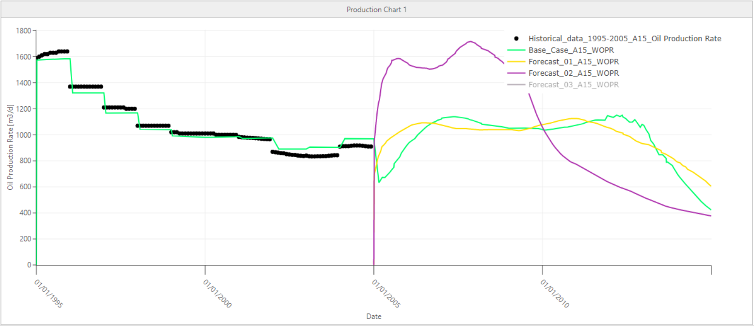
A production chart showing observed oil production rate and simulated forecasts for a well. click to enlarge
Creating a production chart
- Select
 Create new from the Production chart drop-down list. Optionally, enter the name of the production chart in the text field below. By default, a new production chart is named as 'Production Chart <#>'. To modify the name of an existing production chart, use the rename button
  from the toolbar.
 - In the Data tab, if a time series does not yet exist, click to add a time series group. Use the series toolbar to manage your Time Series table.
Adds a new time series group. Duplicates the currently selected time series group. 
Deletes the selected time series group. - On the left side of the tab, click the series group you want to provide the inputs for. The selected row is highlighted in blue. On the right side of the tab, specify the inputs.
The data selection follows a hierarchical manner, from top to bottom. Selecting an option will act as a dynamic filter for the selections below.
- Name Name of the time series group you added or selected in the table on the left. You can update the name in the text field.
- Data set type Select the data set type as Observed or Simulated from the drop-down list. This selection will filter what you see in the Data set table below. The Data sets table is populated with available data sets of the selected type.
- Data sets Check the boxes to select one or more data sets. If you select multiple data sets, the options shown below are a combined collection of all data from the selected data sets.
- Entity type Select the entity type from the drop-down list. This selection will filter what you see in the Entity table below.
- Entities Check the boxes to select one or more entities.
- Series type Select the series type from the drop-down list. This selection will filter what you see in the Series table below.
- Series Check the boxes to select one or more series.
If there is only one data set in your solution that belongs to the selected data set type, it will automatically be selected in the Data set table. The same automatic selection behavior also exists between: Entity type and Entity table, Series type and Series table. - Click Apply to plot the production data and keep the tool open, or click OK to plot the production data in Charts View and close the tool. See Working with the charts display for an overview of chart controls.
Production chart tool tabs
The Production Chart Tool has two tabs, each with specific settings which allow you to create and modify your production chart. With the Data tab you specify the data for the chart, then you can use the Series Format tab to edit how your charts are displayed. Each tab has a left and right section. On the left section you add and/or select a series and the series is highlighted in blue. On the right section you change and specify the settings. Choose the series that you want to show or hide by using the checkbox adjacent to the series in the Time Series table on the Data tab.
On the left side of the tab, click the series group you want to provide the inputs for. The selected row is highlighted in blue. On the right side of the tab, specify the inputs.
Time Series You can create, duplicate, or delete a series group in the table. Use the checkboxes to show or hide the series group or individual series on your chart. Click the series group name you want to provide inputs for. The selected row is highlighted in blue.
|
|
Adds a new time series group. |
|
|
Duplicates the currently selected time series group. |
|
|
Deletes the selected time series group. |
Time Series Group On the right side of the tab you assign inputs to the selected series group.
- Name Name of the time series group you added or selected in the table on the left. You can update the name in the text field.
- Data set type Select the data set type as Observed or Simulated from the drop-down list. This selection will filter what you see in the Data set table below. The Data sets table is populated with available data sets of the selected type.
- Data sets Check the boxes to select one or more data sets. If you select multiple data sets, the options shown below are a combined collection of all data from the selected data sets.
- Entity type Select the entity type from the drop-down list. This selection will filter what you see in the Entity table below.
- Entities Check the boxes to select one or more entities.
- Series type Select the series type from the drop-down list. This selection will filter what you see in the Series table below.
- Series Check the boxes to select one or more series.
In this tab you can format on two different levels: series groups and individual series.
Time Series On the left side of the tab, select the series group or series you want to format. The selected row is highlighted in blue and the right side updates with the relevant settings.
Time Series (Group) Format Depending on your selection of a series group or an individual series, the following options are available:
- Template (Only available for series group) You can create and assign templates to your series groups. With the templates you can format series groups by changing their line or marker style. You do that in the Series Format Template Tool. To create a new one, click the edit
 icon to open the Series Format Template Tool. You can select existing templates from the drop-down list.
 - Use from time series group format To format a single series, uncheck the checkbox.
- Line Format the line for an individual series. For series groups the settings are read only.
- Show line To show or hide lines between the data points.
- Color To change the line color, select a color from the drop-down list.
- Style To change the line style, select a style from the drop-down list.
- Thickness To change the line thickness, enter a number in the field or change the number with the arrow buttons.
- Interpolation To choose how data points are connected, change the line's shape attribute to the desired the interpolation method. You can select an option from the drop-down list: Linear, Spline, Stairstep Hv (horizontal, then vertical), Stairstep Vh (vertical, then horizontal).
- Marker Format the markers for an individual series. For series groups the settings are read only.
- Show marker To show or hide markers at the data points.
- Color To change the marker color, select a color from the drop-down list.
- Style To change the marker style, select a style from the drop-down list.
- Size To change the size of the marker, enter a number in the field or change the number with the arrow buttons.
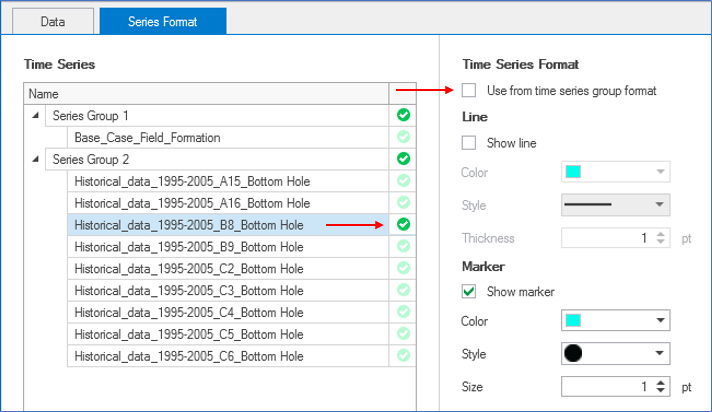
A dark green check indicates the individual series has its own format and is no longer controlled by the series group format. click to enlarge
When you uncheck the Use from series group format checkbox, the following settings are activated to format the style of an individual series:
In this tab you can format the three components of your chart: the axes, the title and the legend.
Components On the left side of the tab, select the component that you want to format. The selected row is highlighted in blue and the right side updates with the relevant settings.
Depending on your component selection, the following options are available:
- Axis From the drop-down list, select which axis you want to format. The axes in the chart are listed per series (e.g., date, cumulative oil production etc).
- Axis range By default, the Auto checkbox is enabled, and the complete data range is displayed in the chart. If you uncheck the checkbox, the Minimum and Maximum entry fields are activated. Based on the data type of the selected axis, you can either select a date, or enter a value.
When you uncheck the Use from series group format checkbox, the following settings are activated to format the style of an individual series:
- Title (only for axes) Format the title for the selected axis.
- Visible By default, the visible option is selected. If you do no want to display a title for the axis, uncheck the box.
- Sames as default When this option is selected, the default name as listed in the axis drop-down list is used. To use a custom name, uncheck the option. The text field is now editable, and you can update the title.
- Font To change the font that is used for the axis title, click on the Font... button. This will open a dialog where you can change the font, the font style and the font size. After changing the settings on the dialog, click OK to update the settings on the Production Chart Tool.
- Tickmark Format the tickmarks for the selected axis.
- Major/Minor You can show or hide tickmarks on your production chart using the checkboxes. By default, tickmarks are shown.
- Auto interval With this option selected, the application will find the best interval for the tickmarks. If you unselect the checkbox, the fields below are enabled and you can set a custom interval
- Grid lines Format the grid lines for the selected axis.
- Major/Minor You can show or hide grid lines on your production chart using the checkboxes. By default, grid lines are hidden. When you select the checkbox, the options below are editable.
- Color Select a color for the grid lines
- Line style Select a line style for the grid lines
- Thickness Select a thickness for the grid lines. You can either enter a value, or use the arrows to increase or decrease the thickness.
- Visible By default, this option is enabled. If you do no want to display a title for the production chart, uncheck the box.
- Sames as chart name When this option is selected, the default name, which is the name of the production chart, is used. To use a custom name, uncheck the option. The text field is now editable, and you can update the title.
- Color Select a color for the chart title.
- Font To change the font that is used for the axis title, click on the Font... button. This will open a dialog where you can change the font, the font style and the font size. After changing the settings on the dialog, click OK to update the settings on the Production Chart Tool.
- Visible By default, the visible option is selected. If you do no want to display the legend for the production chart, uncheck the box.
- Location From the drop-down list, select the location in the chart view where you want to display the legend.
- Text color Select a color for the text of the legend.
- Font To change the font that is used for the legend, click on the Font... button. This will open a dialog where you can change the font, the font style and the font size. After changing the settings on the dialog, click OK to update the settings on the Production Chart Tool.
- Background color The color you select here is used as a background color for the legend.
- Show border You can show or hide a border around the legend on your production chart using the checkbox.
Working with the charts display
When you have plotted a chart in the Charts View, there are various controls on how to display the data.
- Maximizing a single chart - When there are multiple charts in the view, click on the pop out icon
 to maximize the size of the selected chart. To return to the original size, click on the pop in icon
  .
. - Zooming - In the plot area, left mouse button click and keep pressed down to activate zooming. You can move your mouse in the vertical direction, up or down. A preview window indicates the new display window. When you let go of the left mouse button, this is the part of the chart that is shown. To zoom out, double click in the chart area. The Reset Zoom option is also available in the context menu that opens when you click the right mouse button in the chart.
- Zooming along axes - To zoom along only one axis, hover near the edges of the vertical or horizontal axis with your mouse until the tool tip changes into a bidirectional arrow. Left mouse button click and keep pressed down while moving the mouse will zoom the selected axis relative to the other axis.
- Show/hide legend - A right mouse button click in the view opens a context menu with the Show/hide legend option. When the legend is shown, you can also use it as a display filter: when you click on a name, that data is hidden from the chart, and the legend is grayed out.
Context menu for production charts
Right-mouse click on a production chart to access the following controls:
Edit... Opens the Production Chart Tool.
Take Screenshot Copies the image to the clipboard which you can then paste in other applications.
Export to Excel When your machine runs on Windows 10: Copies the complete data set of the displayed series to the clipboard, even if you have formatted the chart as such that not all data is displayed, in a format that can be used in Excel. When your machine runs on Windows 11: Opens Excel with the complete data set of the displayed series, even if you have formatted the chart as such that not all data is displayed.
Remove from View Removes the production chart from the charts view.
Reset Zoom Resets the zoom level to default setting.
Show / Hide Legend Show or hide the legend for the selected production chart.