Property vs time chart
With the Property vs Time form you can visualize how one or two properties change over time at a single location. Using the chart, you can compare different models, or compare your model versus the input data. The recommended way of working is to have a 3D View open with the object that contains the property that you want to visualize displayed.
- Select the type of object that contains the property you want to visualize from the Object drop-down list. You can select one of the following objects to visualize a property:
- Point set
- 3D grid
- 3D mesh
- From the Property drop-down list, select the property of interest. Only properties for the selected object that have time steps are listed.
- Optionally, you can select a secondary property. The property you have already selected, acts as a filter: only properties of the same type and unit are listed in the Secondary property drop-down list.
- Select the location for which you want to visualize the property. You can do this by
- Entering an index number for a grid cell, a node or an element (depending on the selected object). The index number is a unique identifier that you can use to reproduce the chart.
- Clicking at the desired location in the 3D View (make sure the Pick node in 3D View option is selected, and the object of interest is visible in the 3D View)
- Repeat steps 1 trough 4 to visualize another property, or click Close to close the form.
The selection you make here will work as a filter for the next step.
The chart is updated immediately.
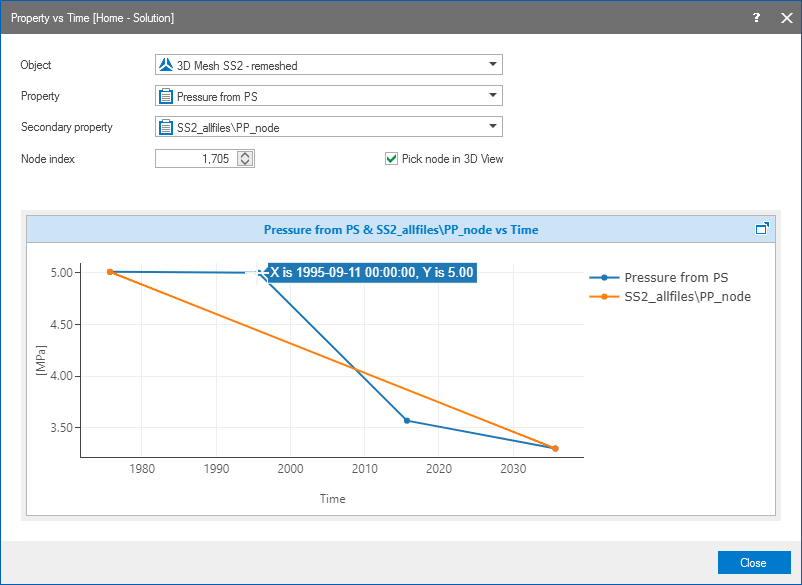
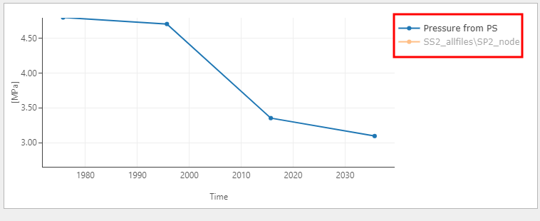
The Property vs Time form with two properties displayed in the charting area. When you hover over a data point, its values are shown click to enlarge
After you have visualized a property that has time steps, you can adjust the way your data is displayed in the charting area using various controls.
Changing format and units - A right mouse button click on the horizontal or vertical axis opens a context menu. You can change the units and the format by making a selection from the options provided to you.
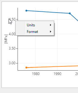
Use the context menu to change the units and the format click to enlarge
Zooming - In the plot area, left mouse button click and keep pressed down to activate zooming. You can move your mouse in any direction. A preview window indicates the new display window. When you let go of the left mouse button, this is the part of the chart that is shown. To zoom out, double click in the chart area.
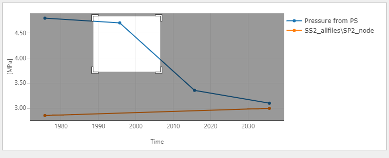
A preview window highlights the new display window click to enlarge
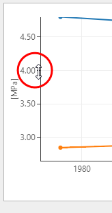
Adjust the values along the axis with the mouse tool tip changed into a bidirectional arrow click to enlarge
Show/hide legend - A right mouse button click in the chart area opens a context menu with the Show/hide legend option. When the legend is shown, you can also use it as a display filter: when you click on a name, that data is hidden from the chart, and the legend is grayed out.
Using the legend as a display filter click to enlarge