Input tables
Input table refers to the spreadsheet-style table that supports a number of data entry and viewing capabilities and is generally used to organize data for a specific operation or calculation purpose. These tables appear as part of a view and, often, multiple input tables are contained within a single view. Input tables are used in a number of areas, from wellbore data input (Wellbore view) to simulation data input (Reservoir Description). Data in these views can be generated automatically, from previously run actions or operations, entered manually, or filled in via copy-paste from an external source, such as an Excel™ spreadsheet.
Data entry
Data entry is a straightforward process and will be familiar to anyone who has experience working with a spreadsheet.
In most cases, input table data is automatically generated through a related action. An example of this is the Wellbore view, which is automatically populated with data when a well is created or imported. Some of this data is read-only, however, generally, most of this data can be edited and additional data may even be specified.
For both manual data entry and copy-paste functions, the input table works just as any generic spreadsheet; clicking into a row will allow you to type in or paste a value. You can also select a range of cells to enter, edit, or paste your data.
The active cell and active row
The active cell is the cell in the view that has the keyboard focus; in other words, this is the cell that will be edited when any typing occurs. A dotted border around a cell indicates that it is active. When a range of cells is selected, the cell that was initially clicked to begin the range selection will be the active cell.
The active row is indicated by a small black arrow icon  that appears next to the row, just to the left of the first column in the table. When selecting a range of rows, the functionality is similar to that of the active cell where the first row selected in the range will be the active row. The active row indicator is especially important when working with tables that have an associated master table, as it allows you to confirm which instance of the table you are working with.
Adding and deleting rows
In most tables rows can be added or deleted from the table. A row is added by filling in the blank row which always appears at the end (bottom) of the table, this row is indicated by an asterisk (*). A row is deleted by selecting the row and pressing the Delete key.
Cell types
There are a number of different cell types that may be encountered when working with input tables. In most cases, the cell simply takes text as input, though different cell types are used when the possible input can only be one of a given set of inputs (such as a drop down or selection box) or if the input needs to be formatted in a certain way, such as a date format. The following is the complete list of cell types:
- Text editor
- Check box
- Drop-down/selection box
- Custom list
- Button edit
- Date edit
Text cell
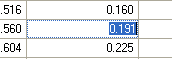
Text cell in the Input table click to enlarge
Any text, whether typed or pasted, is accepted in these cells. Typing after cell selection causes the contents of the cell to be replaced. Pressing the F2 function key activates the text editor in the cell and selects all the text. Instead of replacing the entire contents of the cell, the text string in the cell can be edited. Double clicking on a cell or clicking on the active cell also activates the text editor. In this case the insertion point is positioned under the mouse pointer. Pressing the Enter key accepts an edit for a cell. The Escape key discards edits.
Checkbox
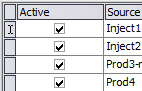
Checkboxes in the Input table click to enlarge
The checkbox is generally used to select a specific row or option. For example, an input table may allow you to choose which rows of data should be active when the related operation is performed; a checkbox is used in these situations to indicate active versus inactive rows. Aside from clicking, the space bar can also be used to change the state of the checkbox.
Drop-down/selection box
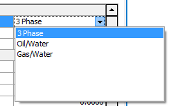
Drop-down list in the Input table click to enlarge
If only a fixed set of possibilities can be selected, a drop-down list is used and the desired input can be selected from the list of options. Both the mouse and keyboard can be used to make the selection. When using the keyboard only, arrow over to the drop-down box, then type in the first letter(s) of the desired option; this will open the drop-down box and you may use the arrow keys to highlight the option, and the Enter key to select.
Custom list
This type of cell is very similar to the drop-down/selection box. It allows selection from a list, but also allows new entries to be added to the list for certain fields. It also allows additional columns in the drop down list as an aid to selection. Often, a long list of unsorted entries appears in the drop down list. Typing the first few letters of the desired entry will begin searching and removes those list items that don't match the typed in criteria.
Button edit
The button edit is used in combination with either the text cell or the drop-down/selection box to add additional edit capability. A common use is to add “...” and “+” labeled buttons. The “...” button will start an edit operation while the “+” button will start an Add New operation. Depending on the option being edited, the buttons here will open a separate entry table or list of advanced options.
Date edit
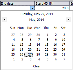
Date edit in the Input table click to enlarge
The date edit is used in a small number of places where an absolute date is required.
Selection
Selection is an important aspect of editing the input table. A selection might be a single cell, an entire row, or a range of cells. Selection has a number of uses, including as a source or target of copy and paste operations.
A single sell is selected by simply clicking on a cell. The cell becomes highlighted. If the cell is already selected, then clicking on the cell has the effect of activating the cell editor. A set of cells can be selected by clicking on a cell and dragging to the end of the desired range. The selected cells are highlighted.
A row is selected in the input table by clicking on the row indicator column at a particular row. An arrow will appear in the row indicator and the selected row will be highlighted. A set of rows can be selected by clicking on the row indicator column at a particular row and dragging down (or up) the row indicator column. The row selection will be highlighted. Alternatively, a shift click can be used to select a range of rows and a control click can be used to add individual rows. The set of rows selected can be non-contiguous.
Certain operations in the input table have different effects depending on whether rows or cells are selected. Delete will clear the cells in a cell select and remove entire rows for a row select. In the two images below, the first shows a table with a range of rows selected, while the second image shows a table with only cells selected.
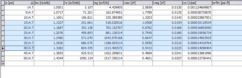
A range of rows selected click to enlarge
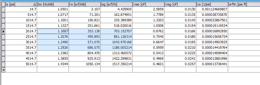
A selection of cells click to enlarge
Other input table features
The input table supports a number of special editing features. Among them are
- Null entries
- Time entry
- Advanced copy and paste operations
- Excel-style editing
- Engineering units support
- Number format support
- Tooltips
- Cell validation
Null entries
Many fields and cells in a view can be empty. An empty field is called a null entry. When a field contains a null entry the corresponding keyword and/or data is not written to the deck. If a field has a value in it, it can be made null by (1) selecting the cell and pressing the delete key or (2) by replacing the value with blanks.
Time entry
Any time entry in the tables can be made as an absolute or relative time. A relative time is a numeric value indicating, for example, the number of days from simulation start. Zero is always set as the minimum relative time. An absolute time is a string in short date format (the short date format can be viewed in the Regional and Language Options in the Control Panel of the system). For example the short date format for US systems is “mm/dd/yy” and for European systems is “dd-mm-yy”. Absolute time can be used only if a starting date has been selected.
Advanced copy and paste operations
The input tables support copy and paste operations for both row select and cell select.
If rows are selected, a copy operation copies all the fields in the selected rows to the clipboard. If a subsequent paste operation occurs in another table, the fields will be pasted into the table for each field with a matching column. If no columns match, then the paste action will not be executed.
If a cell range is selected, only the values in the selected cells are copied to the clipboard. The subsequent paste operation into a table will insert the values into cells in the grid without regard to matching columns.
Cells or rows selected and copied to the clipboard can also be pasted into an Excel™ spreadsheet or other programs. To paste values into a row, select a cell that is to be the upper left hand cell of the block to be pasted. The pasted values will be in the same shape as the values on the clipboard. Rows will be added to the table if necessary to finish the paste operation.
Spreadsheet-style editing
A few editing functions that are similar to those used in Excel™ spreadsheets are supported. If a range of cells is selected and the Delete button is pressed, the cells are emptied. If a value is entered, each cell in the range is set to the same value.
Engineering units support
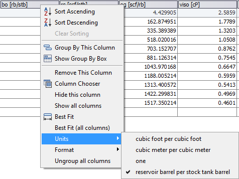
Selecting units click to enlarge
If engineering units are associated with a field, those units are displayed in the column header for the field. Initially these units are determined by the unit’s selection for the entire application. However, the units for a column can be changed directly in the column. To do this, right click on the column or row header and use the 'Units' sub-menu to change the units display. The display units appear in the column header in square brackets.
Number format support
Floating point values that are displayed in cells are displayed with a format that is determined by the engineering units that have been selected for the column. This format can be overridden by using the 'Format' sub-menu of the column header.
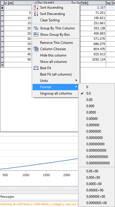
Selecting number format click to enlarge
Tooltips
Where additional information for the use of a cell entry is available, such as special values and usage, a tooltip can be displayed that provides further description. The tooltip is displayed by hovering the mouse over the column header for the field.
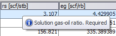
A tooltip click to enlarge
Parameters input
Some views will present a set of input parameters that must be defined for the operation. Opposite of the input table, where you may specify multiple values for a single parameter, these sets of parameters may only have one value specified. Their usage is very similar to the input table in that cell contents may be entered, edited, and copied, however, a few differences exist between the two.
Instead of rows of data in columns with column headers, these parameter tables have a single column of data and sometimes include row headers to further categorize the inputs. Data selection is limited to only those cells in the input column and is broken up by the row headers. For example, in the image below, which is the Parameters input form of the PVT view, you are unable to select all of the input data for both the Densities and Water Properties sections in one, continuous range.
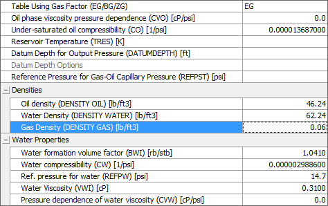
Parameters input click to enlarge