Production Data View (Old)
One of the key outputs of a reservoir simulation is the set of production data that is generated during the simulation run. These rates and flows capture various reservoir characteristics and allow you to confirm that the reservoir model is accurate, if history matching is the focus of the simulation, or can serve as the main deliverable when attempting to forecast reservoir production.
The Production Data View (Old) allows you to visualize this production data, and can be opened via the Views button in the top-right corner of the application, by pressing Alt+F7 on your keyboard, or you can use the Create option of the context menu in the View Explorer. The view provides a means for visualizing production data, such as the oil production rate or bottom-hole pressure, for the entire field, specific wells and even specific grid blocks. The options for visualizing the data are flexible; you can take a standardized approach and display the same properties for a selected entity (such as the entire field or a certain well group), or you can choose to display any combination of data for wells, well groups or grid blocks, all in the same plot.
If your preference is to view production data using an external application, you can export the data to a generic *.rate.ascii file or as a TIBCO Spotfire® file.
Working with the Production Data View (Old)
This section describes the layout, toolbar and basic interactions in the view. For detailed information on import/export of production data and how data is displayed using the Time Series Filter and Manual Data Select tab, see:
- Importing and exporting production data
- Displaying data with the Time Series Filter and Manual Data Select tab
The view is made up of the main chart area, the toolbar and the Manual Data Select tab. Data visualization can be performed from both the toolbar and the Manual Data Select tab, depending on your needs. The toolbar also contains functionality for exporting, zooming and capturing the data plotted in the chart. Additional functionality that allows you to control the color of the curves, create additional chart areas and specify other chart options are available via the right-click context menu of the chart. Each of these features is described below.
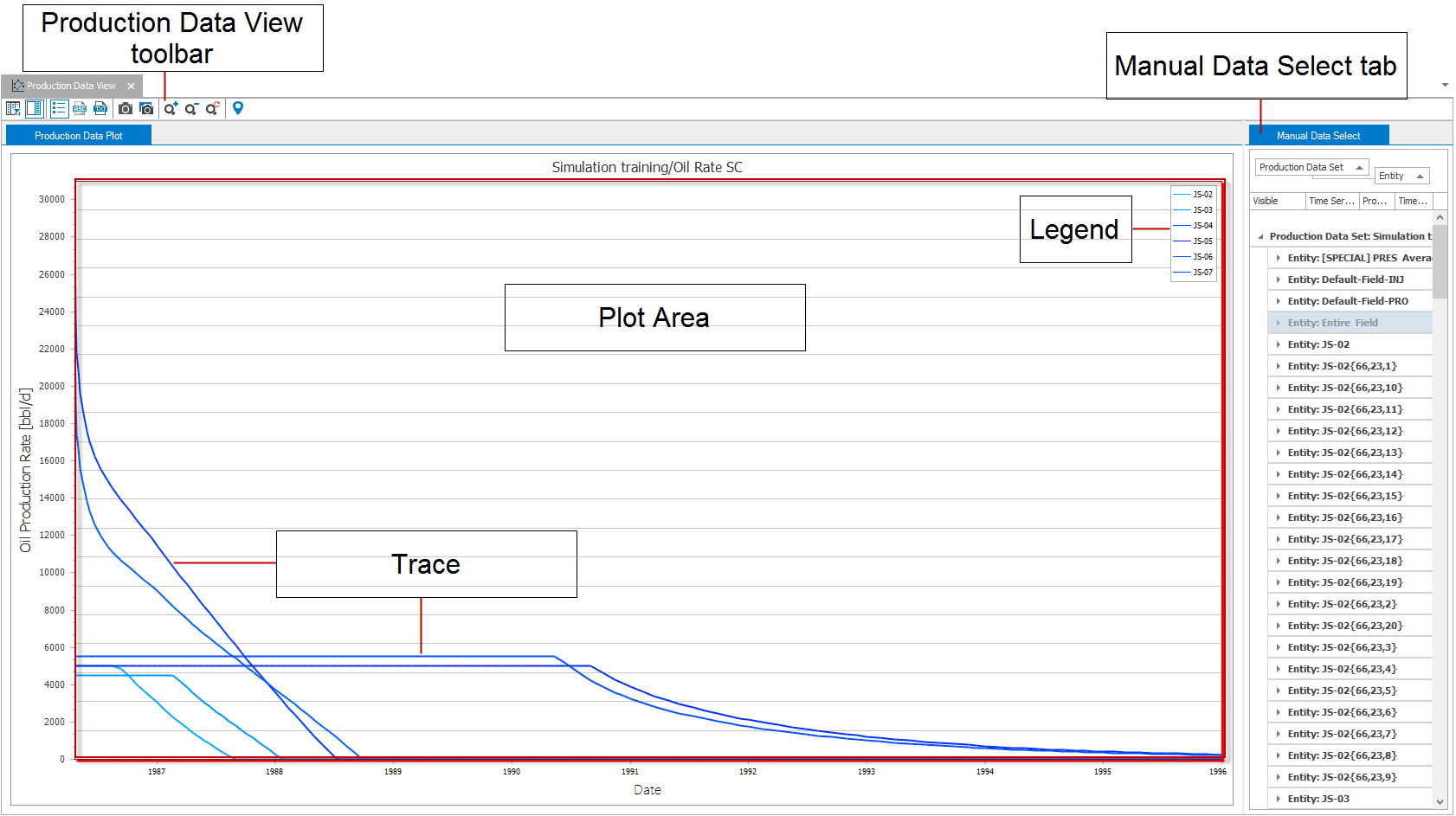
A Production Data View click to enlarge
Production Data View (Old) components
Plot area The main section of the view that displays the data. Multiple plot areas can be added to the view via the context menu.
Trace A single line on the plot indicating data values.
Production Data View toolbar Contains options for displaying, exporting, and capturing data, as well as standard zoom tools for the view.
Manual Data Select tab Panel used to control data displayed on plots.
Legend The description of each trace displayed. Only one legend is displayed regardless of how many plot areas are contained in the view.
Using your mouse in a Production Data View (Old)
Right-click Displays the context menu of the right-clicked object with various customization options (see below). You can right-click the plot area, the axes, the chart title and individual traces to access different display options. See the description of the context menu below.
Right-click and drag (in plotting area) Select area to zoom into. Release the mouse to zoom into the area.
Middle-click and drag (in plotting area) When zoomed into a plot area, click and drag the middle mouse button to pan the plot area in the direction of interest.
Context menus of the Production Data View (Old)
In the Production Data View, you can right-click a number of different objects to customize their display. Different customization options are available in the context menus for the plot areas, axes, chart title and the individual traces. Each of the options is described below. If an option appears grayed-out, it may not be applicable to the clicked item, chart or axis.
General context menu options
The following options are available in the context menu regardless of what object is clicked.
Curve coloring mode Sets the color of the curves based on the associated property template or on the sub-category which the curve resides in.
Add empty pane Adds a new, empty plot area to the Production Data View (Old). This splits the production view so that the additional plot area can be visualized. To interact with the new plot area, simply click it and interact as you would normally.
Delete pane Removes the selected plot area from the view.
Create table view Creates a Flat or a Pivot table of the data. A new tab ‘Table View’ appears at the top of the Production Data View (Old).
Split Split the plot into multiple plots.
- Individually Each line in the plot will be present in an individual plot.
- By property Every line with the same property will be displayed in the same plot.
- By category Every line with the same category will be displayed in the same plot.
- By subcategory Every line with the same sub-category will be displayed in the same plot.
- By template Every line with the same template will be displayed in the same plot.
Combine Combines all displayed plot’s lines in one single plot.
Panes per page As it relates to the Production Data View (Old), the page represents the entire view area. If you have created multiple plot areas via the Add empty pane option, you can control how many plot areas are displayed in the view. For example, if you have six plot areas and have selected 2 in the Panes per page option, you will only see two of the plot areas in the view at any one time. To view the other plot areas, you would scroll down in the view.
Options Opens the Chart Options dialog, where you can specify various display options for the chart, pane, axes, series, chart titles and legend.
Export Exports all of the displayed data to a format that can be pasted into an external application, such as a spreadsheet.
Trace context menu options
The following options are available when a trace is right-clicked.
Visible Controls the visibility of the trace. Clicking this option to uncheck it removes the trace from the view.
Color Sets the line color of the selected line.
Line style Sets the line style of the selected line.
Line thickness Sets the thickness of the selected line.
Marker style Sets the style of the markers of the selected line.
Marker size Specify the size of the markers of the selected line.
Show as step line Changes the display of the selected curve to a stepped curve.
Chart title context menu options
In addition to the general context menu options described above, the following options are available for the chart title.
Format Allows you to switch the display format of the annotation.
X-axis context menu options
In addition to the general context menu options described above, the following options are available for the X-axis.
Format Allows you to switch the display format of the axis annotation.
Show time Allows you to switch the annotation between relative time (days) and absolute time (dates).The default X-axis annotation is in days (e.g., relative time). You can switch to absolute time only in case the selected rates are available in absolute dates. For example, historical rates with date information or simulation results of cases where the start time is specified.
Y-axis context menu options
In addition to the general context menu options described above, the following options are available for the Y-axis.
Unit Allows you to switch the display unit of the axis annotation.
Format Allows you to switch the display format of the axis annotation.
Using the Production Data toolbar
Use the buttons of the toolbar to control the Production Data View (Old).
|
|
Time Series Filter Opens the Time Series Filter form, which is used to display or hide traces in the plot. See Time Series Filter below for information on displaying data using the filter. |
|
|
Show/hide settings panel Used to display or hide the Manual Data Select tab. |
|
|
Show/hide legend Used to display or hide the legend. |
|
|
Export to .rate.ascii file File save dialog appears. The plot data values are saved as a measured rate file. This file can be imported using the Data > Production Data workflow. Useful for diagnostic purposes only. |

|
Export to Spotfire file A dialog appears that allows you to select which production data sets to export. These will be saved as a single Spotfire® file with the name and location you specify. |

|
Print to PDF Opens the print dialog with the option Print to PDF preselected. Optionally, you can select any other print option listed in the Printer name drop-down list. |
|
|
Copy view to clipboard Copies the view to the clipboard so that it may be pasted into another application. |
|
|
Save view to file Opens a Save As dialog where the view can be saved as a variety of image file types such as *.jpg, *.png, and *.tiff. |
|
|
Zoom in Zooms in on the plot. |
|
|
Zoom out Zooms out of the plot. |
|
|
Reset zoom Resets any zoom changes back to the original view. |
|
|
Probe (shortcut key: Ctrl+I) When selected you can hover over any part of the plot to view additional details such as timestep and specific value. |


Displaying data
To open a new Production Data View, select Create Production Data View (Old) from the Views drop-down list in the Workspace section at the right of the Strip. The most basic approach to using the Production Data View (Old) is to create an empty view and add plots and traces to it.
Working with multiple plots
The visible checkboxes selected always represent the selected plots. If a chart contains two or more plots, the state of the visible checkboxes will change as a different plot is selected. Unchecking a box causes the plot to disappear from the selected plot or plots. If more than one plot is selected, checking a visible box causes the trace to appear on all selected plots. In this way you can exert fine grain control over the chart.